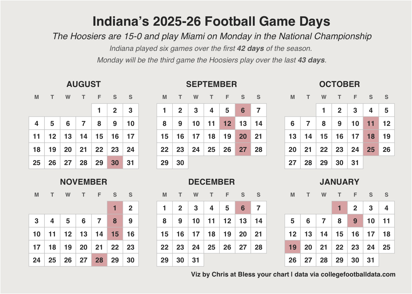
Code
library(rlang)
library(cbbplotR)
# load data
# ranks <- kp_get_ratings(year = 2026)
ranks <- readr::read_csv("ranks.csv")January 16, 2026
game_dates <- as.Date(c(
"2025-08-30", "2025-09-06", "2025-09-12", "2025-09-20",
"2025-09-27", "2025-10-11", "2025-10-18", "2025-10-25",
"2025-11-01", "2025-11-08", "2025-11-15", "2025-11-28",
"2025-12-06", "2026-01-01", "2026-01-09", "2026-01-19"
))
start_date <- as.Date("2025-08-01")
special_indices <- as.numeric(game_dates - start_date) + 1
cal <- calendR::calendR(
from = "2025-08-01",
to = "2026-01-31",
special.days = special_indices,
special.col = "#E0B2B2",
title = "",
subtitle = "",
bg.col = "#EEEDEB",
low.col = "white",
mbg.col = "transparent",
col = "#cccccc",
lwd = 0.25,
lty = 1,
font.style = "bold",
font.family = "sans",
months.size = 10,
months.col = "#333333",
weeknames = c("M", "T", "W", "T", "F", "S", "S"),
weeknames.size = 3,
weeknames.col = "#666666",
day.size = 3,
days.col = "#333333",
start = "M",
orientation = "p"
) +
ggplot2::labs(
title = "Indiana's 2025-26 Football Game Days",
subtitle = "The Hoosiers are 15-0 and play Miami on Monday in the National Championship<br>
<span style='color:#666666;font-size:9pt;'>Indiana played six games over the first <b>42 days</b> of the season. <br>Monday will be the third game the Hoosiers play over the last <b>43 days</b>.</span>",
caption = "Viz by Chris at Bless your chart | data via collegefootballdata.com"
) +
ggplot2::theme(
plot.title = ggtext::element_markdown(
size = 16,
face = "bold",
color = "#333333",
margin = ggplot2::margin(b = 5)
),
plot.subtitle = ggtext::element_markdown(
size = 11,
color = "#333333",
lineheight = 1.3,
margin = ggplot2::margin(b = 15)
),
plot.caption = ggtext::element_markdown(
size = 8,
color = "#333333",
),
plot.margin = ggplot2::margin(20, 20, 20, 20),
legend.position = "none"
)
cal
ranks_plot <- ranks |>
dplyr::mutate(
tier = dplyr::case_when(
RankAdjEM <= 10 ~ "1-10",
RankAdjEM <= 50 ~ "11-50",
RankAdjEM <= 100 ~ "51-100",
RankAdjEM <= 200 ~ "101-200",
RankAdjEM <= 300 ~ "201-300",
TRUE ~ "301+"
),
tier = factor(tier, levels = c(
"1-10", "11-50", "51-100", "101-200", "201-300", "301+"
))
) |>
ggplot2::ggplot(ggplot2::aes(x = 1, y = AdjEM)) +
ggplot2::geom_segment(
ggplot2::aes(
x = 0.5,
xend = 1.5,
yend = AdjEM,
color = tier
),
linewidth = .01,
alpha = 0.1
) +
ggplot2::geom_point(
ggplot2::aes(color = tier),
position = ggplot2::position_jitter(
width = 0.09,
height = 0,
seed = 123
)
) +
ggplot2::geom_text(ggplot2::aes(
label = ifelse(
RankAdjEM %in% c(1, 10, 25, 50, 100, 150, 200, 250, 300,
350, 365),
RankAdjEM,
""
),
x = 0.65
),
size = 4,
hjust = 1,
family = "Roboto Condensed") +
ggplot2::scale_color_viridis_d(
option = "turbo",
direction = -1,
begin = 0.2,
end = 0.8
) +
ggplot2::scale_x_continuous(limits = c(0, 2)) +
ggplot2::scale_y_continuous(
limits = c(-35, 40),
breaks = seq(-35, 40, by = 15)
) +
ggplot2::labs(
title = "College Basketball's Rating Reality",
subtitle = "Shows a team's actual kenpom rating compared to its ordinal rating.",
x = "",
y = "Rating",
caption = "Viz by Chris at Bless your chart | data through January 15 games \ndata via kenpom.com | Rating = adjusted efficiency margin",
color = ""
) +
hrbrthemes::theme_ipsum() +
ggplot2::theme(
plot.title = ggplot2::element_text(
hjust = 0.5,
size = 20,
family = "Roboto Condensed"
),
plot.subtitle = ggtext::element_markdown(
hjust = 0.5,
size = 9.5,
lineheight = 1.5,
family = "Roboto Condensed"
),
legend.position = "none",
axis.text.x = ggplot2::element_blank(),
axis.text.y = ggplot2::element_text(size = 14, family = "Roboto Condensed"),
plot.caption = ggplot2::element_text(face = "plain", size = 8, "Roboto Condensed")
) +
ggplot2::annotate(
cfbplotR::GeomCFBlogo,
x = .80,
y = 36.3,
team = "Michigan", # 1 rank
height = 0.055,
alpha = 0.8
) +
ggplot2::annotate(
cfbplotR::GeomCFBlogo,
x = 0.8,
y = 29,
team = "Florida", #10 rank
height = 0.055,
alpha = 0.8
) +
ggplot2::annotate(
geom = "curve", # distance to 10 and 1/2
color = "#474747",
x = 1.15,
y = 30,
xend = 1.15,
yend = 37,
curvature = .6,
arrow = ggplot2::arrow(length = grid::unit(2, "mm"),
ends = "both")
) +
ggplot2::annotate(
cfbplotR::GeomCFBlogo,
x = 0.8,
y = 22,
team = "NC State", # 25 rank
height = 0.055,
alpha = 0.8
) +
ggplot2::annotate(
cfbplotR::GeomCFBlogo,
x = 0.8,
y = 16.3,
team = "Washington", # 50 rank
height = 0.055,
alpha = 0.8
) +
ggplot2::annotate(
geom = "curve", # distance from 25 to 50
color = "#474747",
x = 1.15,
y = 16,
xend = 1.15,
yend = 22,
curvature = .6,
arrow = ggplot2::arrow(length = grid::unit(2, "mm"), ends = "both")
) +
ggplot2::annotate(
cfbplotR::GeomCFBlogo,
x = 0.8,
y = 7.5,
team = "Wyoming", # 100 rank
height = 0.055,
alpha = 0.8
) +
ggplot2::annotate(
cfbplotR::GeomCFBlogo,
x = 0.8,
y = 1.5,
team = "Kent St.", #150 rank
height = 0.055,
alpha = 0.8
) +
ggplot2::annotate(
cfbplotR::GeomCFBlogo,
x = 0.8,
y = -3.3,
team = "Oregon St.", # 200 rank
height = 0.055,
alpha = 0.8
) +
ggplot2::annotate(
geom = "curve", # distance from 100 to 10
color = "#474747",
x = 1.25,
y = 8.5,
xend = 1.25,
yend = 30,
curvature = .6,
arrow = ggplot2::arrow(length = grid::unit(2, "mm"),
ends = "both")
) +
ggplot2::annotate(
cfbplotR::GeomCFBlogo,
x = 0.8,
y = -7,
team = "Merrimack", # 250 rank
height = 0.055,
alpha = 0.8
) +
ggplot2::annotate(
cfbplotR::GeomCFBlogo,
x = 0.8,
y = -11.9,
team = "Alabama A&M", # 300 rank
height = 0.055,
alpha = 0.8
) +
ggplot2::annotate(
geom = "curve", # distance from 300 to 100
color = "#474747",
x = 1.25,
y = 7.5,
xend = 1.25,
yend = -12,
curvature = -.6,
arrow = ggplot2::arrow(length = grid::unit(2, "mm"),
ends = "both")
) +
ggplot2::annotate(
cfbplotR::GeomCFBlogo,
x = 0.8,
y = -18.5,
team = "Rider", # 350 rank
height = 0.055,
alpha = 0.8
) +
ggplot2::annotate(
cfbplotR::GeomCFBlogo,
x = 0.8,
y = -33.3,
team = "Mississippi Valley St.", # 365 rank
height = 0.055,
alpha = 0.8
) +
ggplot2::annotate(
"label",
x = 1.75,
y = 30,
label = "The ratings gap \nbetween #10 and the \n#1 is greater than \nthe gap from \n#25 to #50",
size = 3,
color = "#333333",
family = "Roboto Condensed",
fill = "floral white"
) +
ggplot2::annotate(
"label",
x = 1.75,
y = -10,
label = "The gap from \n#100 to #300 is less \nthan the gap from \n#10 to #100",
size = 3,
color = "#333333",
family = "Roboto Condensed",
fill = "floral white",
)
ggplot2::ggsave("ranks_plot.png",
ranks_plot,
w = 6.5,
h = 8.5,
dpi = 600,
bg = "white",
type = "cairo")
ranks_plot