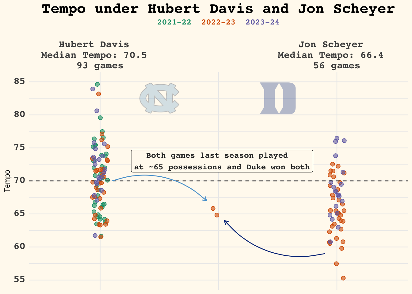
074: Duke/UNC Tempo

geom_jitter
Published

February 1, 2024

Data

Code
# Function to update conference abbreviations to be more friendly 
duke_factors <- cbbdata::cbd_torvik_game_factors(team = "Duke") |> 
  dplyr::filter(year > 2022) |> 
  dplyr::select(date, year, coach, team, opp, result, tempo, loc, result,
                pts_scored, pts_allowed) |> 
  dplyr::filter(opp != "North Carolina")

cbbdata::cbd_torvik_game_factors(team = "Duke") |> 
  dplyr::group_by(coach, year) |> 
  dplyr::summarise(
    total_games = dplyr::n(), 
    under = sum(tempo < 70),
    under_pct = under/total_games
  )
# A tibble: 17 × 5
# Groups:   coach [2]
   coach            year total_games under under_pct
   <chr>           <dbl>       <int> <int>     <dbl>
 1 Jon Scheyer      2023          36    29     0.806
 2 Jon Scheyer      2024          20    15     0.75 
 3 Mike Krzyzewski  2008          34     5     0.147
 4 Mike Krzyzewski  2009          37    23     0.622
 5 Mike Krzyzewski  2010          40    31     0.775
 6 Mike Krzyzewski  2011          37    22     0.595
 7 Mike Krzyzewski  2012          34    21     0.618
 8 Mike Krzyzewski  2013          36    21     0.583
 9 Mike Krzyzewski  2014          35    28     0.8  
10 Mike Krzyzewski  2015          39    32     0.821
11 Mike Krzyzewski  2016          36    22     0.611
12 Mike Krzyzewski  2017          37    16     0.432
13 Mike Krzyzewski  2018          37    20     0.541
14 Mike Krzyzewski  2019          38    12     0.316
15 Mike Krzyzewski  2020          31     7     0.226
16 Mike Krzyzewski  2021          24    15     0.625
17 Mike Krzyzewski  2022          39    27     0.692
Code
# UNC exploratory 
unc_factors <- cbbdata::cbd_torvik_game_factors(team = "North Carolina") |> 
  dplyr::filter(year > 2021) |> 
  dplyr::select(date, year, coach, team, opp, result, tempo, loc, result,
                pts_scored, pts_allowed) |> 
  dplyr::filter(opp != "Duke")

cbbdata::cbd_torvik_game_factors(team = "North Carolina") |> 
  dplyr::group_by(coach, year) |> 
  dplyr::summarise(
    total_games = dplyr::n(), 
    under = sum(tempo < 70),
    under_pct = under/total_games
  )
# A tibble: 17 × 5
# Groups:   coach [2]
   coach         year total_games under under_pct
   <chr>        <dbl>       <int> <int>     <dbl>
 1 Hubert Davis  2022          39    19     0.487
 2 Hubert Davis  2023          33    19     0.576
 3 Hubert Davis  2024          21     6     0.286
 4 Roy Williams  2008          39     7     0.179
 5 Roy Williams  2009          37     7     0.189
 6 Roy Williams  2010          37    13     0.351
 7 Roy Williams  2011          37    10     0.270
 8 Roy Williams  2012          38    11     0.289
 9 Roy Williams  2013          35    13     0.371
10 Roy Williams  2014          34    16     0.471
11 Roy Williams  2015          38    23     0.605
12 Roy Williams  2016          40    20     0.5  
13 Roy Williams  2017          39    11     0.282
14 Roy Williams  2018          37    13     0.351
15 Roy Williams  2019          36     6     0.167
16 Roy Williams  2020          33    13     0.394
17 Roy Williams  2021          29     6     0.207
Code
# Duke 
duke_only <- cbbdata::cbd_torvik_game_factors(team = "North Carolina") |> 
  dplyr::filter(opp == "Duke" & year == 2023) |> 
  dplyr::select(date, year, coach, team, opp, result, tempo, loc, result,
                pts_scored, pts_allowed) |> 
  dplyr::mutate(coach = dplyr::if_else(coach == 'Hubert Davis',
                                       "Ike", coach))

Jitter plot

Code
# Plot functions 
my_fill <- ggplot2::aes(fill = ggplot2::after_scale(ggplot2::alpha(colour, 0.6)))

theme_me <- function() {
  # Create a base theme with minimal style
  base_theme <- ggplot2::theme_minimal(base_size = 10, base_family = "RobotoCondensed-Regular")
  
  # Customize the base theme with additional modifications
  custom_theme <- base_theme +
    ggplot2::theme(
      plot.title = ggplot2::element_text(
        hjust = 0.5,
        size = 24,
        face = "bold"
      ),
      plot.subtitle = ggplot2::element_text(
        hjust = 0.5,
        size = 10,
        lineheight = 0.25,
        vjust = -0.5
      ),
      plot.caption = ggplot2::element_text(
        hjust = 1,
        size = 6,
        lineheight = 0.35,
        margin = ggplot2::margin(t = 20)
      ),
      plot.background = ggplot2::element_rect(fill = "floralwhite", color = "floralwhite")
    )
  
  return(custom_theme)
} 

# combine the datasets 

unc_duke_tempo <- dplyr::bind_rows(unc_factors, duke_factors,
                                   duke_only)

unc_duke_tempo |> 
  ggplot2::ggplot(ggplot2::aes(x = coach, y = tempo)) + 
  ggplot2::geom_jitter(shape = 21, width = .065, size = 2,
                 ggplot2::aes(colour = factor(year),!!!my_fill)) +
  theme_me() +
  ggplot2::labs(x = "", y = "Tempo", 
                title = "Tempo under Hubert Davis and Jon Scheyer",
                subtitle = "<span style='color: #1b9e77;'>2021-22</span> <span style='color: #d95f02;'>2022-23</span>  <span style='color: #7570b3;'>2023-24</span>") +
  ggplot2::scale_x_discrete(position = "top", labels = 
                              c("Hubert Davis  \nMedian Tempo: 70.5  \n93 games", "",
                                "Jon Scheyer  \nMedian Tempo: 66.4  \n56 games")) +
  ggplot2::scale_y_continuous(limits = c(55, 85), 
                              breaks = seq(55, 85, 5)) +
  ggplot2::scale_color_manual(values = c("#1b9e77", "#d95f02", 
                                         "#7570b3")) +
  ggplot2::geom_hline(yintercept = 70, linetype = "dashed",
                      color = "#333333") +
  ggplot2::theme(legend.position = "none", 
                 plot.title = ggtext::element_markdown(size = 18, face ='bold', family = 'mono'),
                 strip.text.x = ggtext::element_markdown(size = 12, 
                                                         face ='bold', family = 'mono'),
                 plot.subtitle = ggtext::element_markdown(size = 10, family = "mono", face = "bold"),
                 plot.caption = ggtext::element_markdown(size = 7, family = 'mono'),
                 axis.text.x = ggtext::element_markdown(size = 12, family = 'mono', face ='bold'),  
                 axis.text.y = ggtext::element_markdown(size = 12, family = 'mono', face ='bold')
  ) +
  ggplot2::annotate(
    geom = "curve",
    color = "#56a0d3",
    x = 1.1,
    y = 70,
    xend = 1.9,
    yend = 67,
    curvature = -.3,
    arrow = ggplot2::arrow(length = ggplot2::unit(2, "mm"))
  ) +
  ggplot2::annotate(
    geom = "curve",
    color = "#003087",
    x = 2.9,
    y = 59,
    xend = 2.05,
    yend = 64,
    curvature = -.3,
    arrow = ggplot2::arrow(length = ggplot2::unit(2, "mm"))
  ) +
  ggplot2::annotate(
    "label",
    x = 2.03,
    y = 73,
    label = "Both games last season played  \nat ~65 possessions and Duke won both",
    size = 3.5,
    color = "#333333",
    fill = "floralwhite",
    family = "mono",
    fontface = "bold"
  ) + 
  ggplot2::annotate(cfbplotR::GeomCFBlogo,x = 2.5, 
                    y = 82.5,team = "Duke",height = .18, alpha = .3) +
  ggplot2::annotate(cfbplotR::GeomCFBlogo,x = 1.5, 
                    y = 82.5, team = "North Carolina",height = .20,
                    alpha = .3) -> hubert_jon 


ggplot2::ggsave(
  "scheyer_davis.png",
  hubert_jon,
  w = 8,
  h = 10.5,
  dpi = 600,
  type = 'cairo'
)


hubert_jon