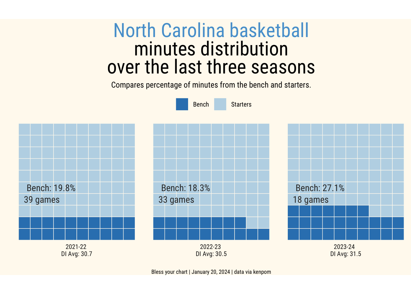
# Build data from kenpommin_df <- tibble::tribble(~year,~min_pct,~type,~games,2024,27.1,"bench",18,2024,72.9,"start",18,2023,18.3,"bench",33,2023,81.7,"start",33,2022,19.8,"bench",39,2022,80.2,"start",39)
Waffle Plot
Code
theme_me <-function() {# Create a base theme with minimal style base_theme <- ggplot2::theme_minimal(base_size =10, base_family ="RobotoCondensed-Regular")# Customize the base theme with additional modifications custom_theme <- base_theme + ggplot2::theme(plot.title = ggplot2::element_text(hjust =0.5,size =24,face ="bold" ),plot.subtitle = ggplot2::element_text(hjust =0.5,size =10, ),plot.caption = ggplot2::element_text(hjust =0.5,size =6,lineheight =0.35,margin = ggplot2::margin(t =0.5) ),plot.background = ggplot2::element_rect(fill ="floralwhite", color ="floralwhite") )return(custom_theme)} min_df |> dplyr::mutate(min_pct =round(min_pct)) |> ggplot2::ggplot(ggplot2::aes(fill = type, values = min_pct)) + waffle::geom_waffle(color ="floralwhite", size = .25, rows =10, flip =TRUE) + ggplot2::facet_wrap(~year, nrow =1, strip.position ="bottom",labeller = ggplot2::labeller(year =c("2022"="2021-22 \nDI Avg: 30.7","2023"="2022-23 \nDI Avg: 30.5","2024"="2023-24 \nDI Avg: 31.5"))) + ggplot2::scale_x_discrete() + ggplot2::scale_y_continuous(labels =function(x) x *10, expand =c(0,0)) + ggplot2::scale_fill_manual("",values=c("start"="#bdd7e7", "bench"="#3182bd"),labels=c("Bench", "Starters")) + ggplot2::coord_equal() + ggplot2::labs(title ="<span style='color:#56a0d3;'>North Carolina basketball</span> \nminutes distribution \nover the last three seasons",subtitle ="Compares percentage of minutes from the bench and starters.",x ="",y ="",caption ="Bless your chart | January 20, 2024 | data via kenpom" ) +theme_me() + ggplot2::guides(fill = ggplot2::guide_legend()) + ggplot2::theme(panel.grid = ggplot2::element_blank(),axis.ticks.y = ggplot2::element_blank(),axis.text.y = ggplot2::element_blank()) + ggplot2::theme(legend.position ="top", plot.title = ggtext::element_markdown(), plot.subtitle = ggtext::element_markdown(),plot.caption = ggtext::element_markdown(size =7),plot.margin = ggplot2::margin(5,0,0,0)) + ggplot2::geom_text(data = min_df |> dplyr::filter(type =="bench"), ggplot2::aes(x =3.3, y =5, label =paste0("Bench: ", min_pct, "%")),color ="#333333", size =4, family ="RobotoCondensed-Regular", fontface ="bold") + ggplot2::geom_text(data = min_df |> dplyr::filter(type =="bench"), ggplot2::aes(x =2.5, y =4, label =paste0(games, " games")),color ="#333333", size =4, family ="RobotoCondensed-Regular", fontface ="bold") -> waf_plotggplot2::ggsave("waf_plot.png", waf_plot,w =7.5,h =5,dpi =600,type ='cairo')waf_plot