064: UNC by Month

geom_tile
Published

December 30, 2023

Data and theme

Code
mack <- readr::read_csv("unc_mack.csv")

mack |> 
  dplyr::mutate(Month = lubridate::month(lubridate::dmy(Date), label = TRUE,
                                         abbr = FALSE)) |> 
  dplyr::group_by(Month, Season) |> 
  dplyr::summarise(delta = sum(Diff), 
                   color = dplyr::if_else(delta > 0, "positive", "negative"),
                   wins = sum(...11 == "W"), 
                   loss = sum(...11 == "L")) |> 
  dplyr::mutate(delta = dplyr::if_else(delta > 0, 
                                       paste0("+", delta), 
                                       as.character(delta))) -> tiles

theme_me <- function() {
  # Create a base theme with minimal style
  base_theme <- ggplot2::theme_minimal(base_size = 10, base_family = "RobotoCondensed-Regular")
  
  # Customize the base theme with additional modifications
  custom_theme <- base_theme +
    ggplot2::theme(
      plot.title = ggplot2::element_text(
        hjust = 0.5,
        size = 24,
        face = "bold"
      ),
      plot.subtitle = ggplot2::element_text(
        hjust = 0.5,
        size = 10,
        lineheight = 0.25,
        vjust = -0.5
      ),
      plot.caption = ggplot2::element_text(
        hjust = 0.5,
        size = 6,
        lineheight = 0.35,
        margin = ggplot2::margin(t = 0.5)
      ),
      plot.background = ggplot2::element_rect(fill = "floralwhite", color = "floralwhite")
    )
  
  return(custom_theme)
} 

Tile plot

Code
month_order <- c("AUGUST", "SEPTEMBER", "OCTOBER", "NOVEMBER",
                  "DECEMBER", "JANUARY")


tile_plot <- tiles |> 
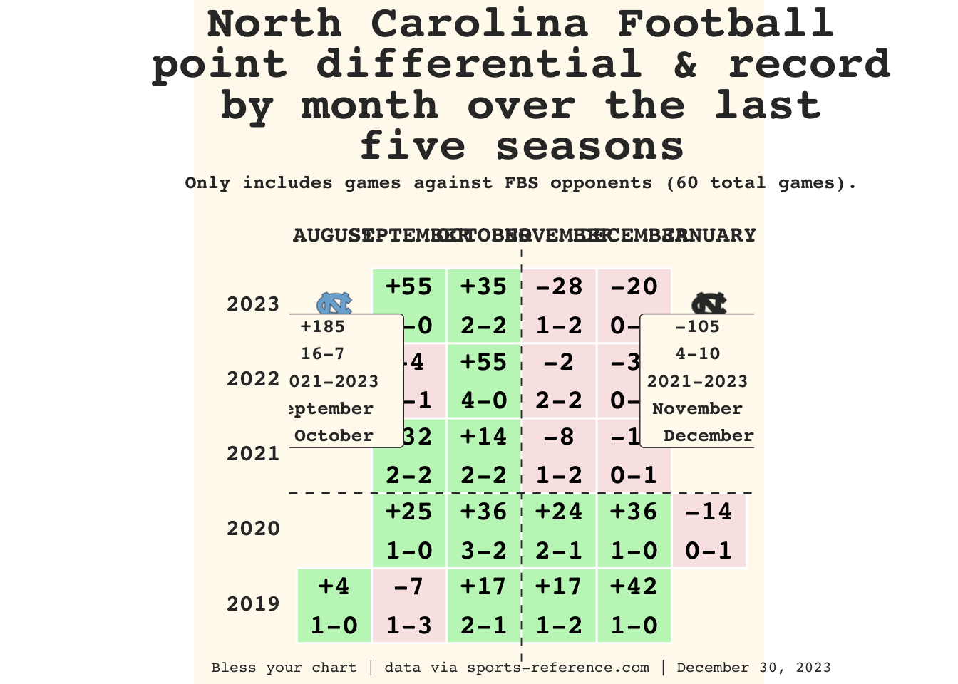
  dplyr::mutate(label_ant = paste0(delta, "\n", wins, "-", loss),
                Month = toupper(Month)) |> 
  ggplot2::ggplot(ggplot2::aes(x = factor(Month, levels = month_order), y = Season, fill = factor(color))) + 
  ggplot2::geom_tile(color = "white", size = .5) +
  ggplot2::geom_text(ggplot2::aes(label=label_ant), vjust = .50,
                     fontface ='bold', family = 'mono',
                     size = 5) +
  ggplot2::scale_fill_manual(values = c("#F9E5E5", "#c1f5c1"), name = NULL) +
  ggplot2::scale_x_discrete(position = "top") +
  ggplot2::coord_equal() +
  theme_me() +
  ggplot2::theme(legend.position = "none", 
                 plot.title = ggtext::element_markdown(face ='bold', color = "#333333", family = 'mono'),
                 plot.subtitle = ggtext::element_markdown(face ='bold',  color = "#333333", family = 'mono'),
                 plot.caption = ggtext::element_markdown(size = 8, family = 'mono',
                                                         color = "#333333"),
                 axis.text.x = ggtext::element_markdown(size = 12, 
                                                        family = 'mono', 
                                                        face = 'bold', 
                                                        color = "#333333"),  
                 axis.text.y = ggtext::element_markdown(size = 12, family = 'mono', 
                                                        color = "#333333",
                                                        face = 'bold'),
                 panel.grid = ggplot2::element_blank()
  ) +
  ggplot2::annotate(
    cfbplotR::GeomCFBlogo,
    x = 1,
    y =2023,
    team = "North Carolina",
    height = .095
  ) +
  ggplot2::annotate(
    cfbplotR::GeomCFBlogo,
    x = 6,
    y =2023,
    team = "North Carolina",
    height = .095,
    color = "#333333",
  ) +
  ggplot2::labs(x = "",
                y = "",
                title = "North Carolina Football  \npoint differential & record  \nby month over the last  \nfive seasons",
                subtitle = "Only includes games against FBS opponents (60 total games).",
                caption = "Bless your chart | data via sports-reference.com | December 30, 2023") +
  ggplot2::annotate(
    "label",
    x = 1,
    y = 2022,
    label = "+185  \n16-7  \n2021-2023 \nSeptember  \nOctober",
    family = "mono",
    size = 3.5,
    color = "#333333",
    fontface = "bold",
    fill = "floral white"
  ) +
  ggplot2::annotate(
    "label",
    x = 6,
    y = 2022,
    label = "-105  \n4-10  \n2021-2023  \nNovember  \nDecember",
    family = "mono",
    size = 3.5,
    color = "#333333",
    fontface = "bold",
    fill = "floral white"
  ) +
  ggplot2::geom_vline(xintercept = 3.5,
                      linetype = 'dashed',
                      color = "#333333") +
  ggplot2::geom_hline(yintercept = 2020.5,
                      linetype = 'dashed',
                      color = "#333333")

tile_plot

Code
ggplot2::ggsave(
  "tile_plot.png",
  tile_plot,
  w = 8,
  h = 8,
  dpi = 600,
  type = 'cairo'
)