# area plot
label_years <- c(1988, 1998, 2005, 2013, 2019, 2022)
mb_plot <- mack_wins |>
ggplot2::ggplot(ggplot2::aes(x = Year, y = totalwins, fill = School)) +
ggplot2::geom_area(data = mack_wins |> dplyr::filter(School == "North Carolina" & Year < 1998), position = "stack", alpha = 0.7) +
ggplot2::geom_area(data = mack_wins |> dplyr::filter(School == "North Carolina" & Year > 2018), position = "stack", alpha = 0.7) +
ggplot2::geom_area(data = mack_wins |> dplyr::filter(School == "Texas"), position = "stack", alpha = 0.7) +
cfbplotR::scale_fill_cfb() +
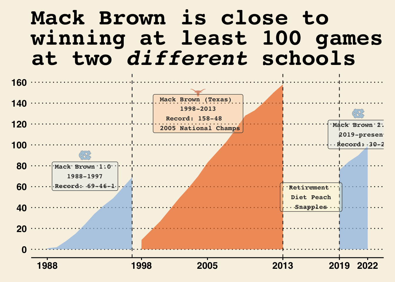
ggplot2::labs(title = "Mack Brown is close to \nwinning at least 100 games \nat two <em>different</em> schools",
x = "",
y = "",
fill = "School") +
ggplot2::scale_x_continuous(breaks = label_years, labels = label_years) +
ggplot2::scale_y_continuous(breaks = seq(0, 160, 20), limits =c(0, 160)) +
ggthemes::theme_wsj() +
ggplot2::theme(plot.title = ggtext::element_markdown()) +
ggplot2::geom_vline(xintercept = c(1997, 2013, 2019),
linetype = 'dashed',
color = "#333333") +
ggplot2::annotate(
cfbplotR::GeomCFBlogo,
x = 2004,
y =150,
team = "Texas",
height = .085,
alpha = 0.6
) +
ggplot2::annotate(
cfbplotR::GeomCFBlogo,
x = 1992,
y =90,
team = "North Carolina",
height = .075,
alpha = 0.6
) +
ggplot2::annotate(
cfbplotR::GeomCFBlogo,
x = 2021,
y =130,
team = "North Carolina",
height = .075,
alpha = 0.6
) +
ggplot2::annotate(
geom = "label",
x = 1992,
y = 70,
color = "#333333",
fill = "#e4f0f8",
label = "Mack Brown 1.0 \n 1988-1997 \nRecord: 69-46-1",
size = 3,
fontface = 'bold',
family = 'mono',
alpha = 0.3
) +
ggplot2::annotate(
geom = "label",
x = 2021.5,
y = 110,
color = "#333333",
fill = "#e4f0f8",
label = "Mack Brown 2.0 \n 2019-present \nRecord: 30-22",
size = 3,
fontface = 'bold',
family = 'mono',
alpha = 0.3
) +
ggplot2::annotate(
geom = "label",
x = 2004,
y = 130,
color = "#333333",
fill = "#ffc18d",
label = "Mack Brown (Texas) \n 1998-2013 \nRecord: 158-48 \n 2005 National Champs",
size = 3,
fontface = 'bold',
family = 'mono',
alpha = 0.3
) +
ggplot2::annotate(
geom = "label",
x = 2016,
y = 50,
color = "#333333",
fill = "#ffffd8",
label = "Retirement \n Diet Peach \nSnapples",
size = 3,
fontface = 'bold',
family = 'mono',
alpha = 0.3
)
ggplot2::ggsave(
"mb.png",
mb_plot,
w = 11.3,
h = 8,
dpi = 600,
type = 'cairo'
)
mb_plot